Make your own superhero snowflakes

I designed a few superhero-themed snowflake templates pdfs for you to make at home.

  1. Based on Batman's cowl and cape
  2. Storm from the Uncanny X-Men, using her headdress, lightening bolts, and the X-Men's logo/symbol in the middle
  3. Iron Man's mask combined with the circular and triangular chest reactor thing.
  4. Wonder Woman's "W" logo from her chest and the shape of her tiara.
  5. The Punisher logo with hunting knives.

Just click on the thumbnails below to download, print and cut out with a pair of sharp scissors.

Here are step-by-step instructions of how to cut them out.

Gødland Finale - typography, lettering, and layouts

For the Gødland Finale I was asked to design a lettering treatment for titles and credits, which would also to work within the context of the art as an expressive tool. For the signature style I used a variety of highly condensed fonts, the jewel-toned color palette created by colorist Brad Simpson, off-center white outlines, and a background of stars. (Below are a few examples, click to view larger versions.)

Within the comic book itself I created a collage of panels from the previous issue to introduce the story (see second image above). As the story progressed I incorporated more "classic" comic book lettering techniques, for example on the 12 page spread below, (conceived by writer Joe Casey, drawn by artist Tom Scioli, and colored by Simpson), I used arrow-shaped text boxes which move along the length of the spread and eventually flow with the lines of the art. Following that (to the right of the spread) is an example of the lettering used to indicate the evolution of the story as the chapters transition and the character's observations change. (Below you can see the spread and transition as it looked in the comic book, and below that the full length design as it is uncut. Click to enlarge.)

The Bounce Covers - Step-by-step & BIG

A couple of months ago I posted some small images of the cover design process for "The Bounce". After a few requests for an interface that would more easily allow detailed viewing, I've posted a gallery of each cover at each stage. (Click on the images to see full-size versions.)

In the first steps, you can clearly see the concept Photoshop mockups I send to the brilliant David Messina, who then uses them to inspire his gorgeous cover art (shown in the second step). In the third step are the completed covers, where you can see that I sometimes alter a tiny aspect of the color, or zoom in on the art, as well as adding the overlay of logo, ink splatter, and all of the functional elements. This is a process I do with David's approval (he is a fantastic collaborator) before I send the covers to print.

Sex (1-8) - Title Page Spreads

For the ongoing comic book "Sex", I was asked to create a series of double page spreads to act as title pages for each chapter.

These pages needed to evoke the mood of the story, with the protagonist discovering his city as if for the first time. To do this I took a series of photographs of large buildings from a low viewpoint, emphasizing the overwhelming, inhuman scale of them. Then I created a color overlay which would echo the main color used on the cover of each issue, heavily rasterizing each image into a bold duotone.

Overlaying these images is a tightly condensed, oversized title, with the usual legal blocks of text manipulated into tall or long blocks to act as graphic elements en masse.

(The comic is available from comic book stores each month, or online in a digital format.)

Dalai Lama Image & Quotation

Three variations on a theme which I was playing with, overlaying this quote on to these gorgeous photographs which Christoph Michel took of the Dalai Lama. I'm not sure which I prefer, so I'm posting them all here.

The Bounce - Cover Creation Process

As part of the design work on the comic book "The Bounce", I create mockups of my cover concepts so that the artist (David Messina) will have something to refer to. Then he sends me the raw art to create the cover design from. Here are the first 9 issues of the comic, from concept through to finished covers.

(Click on the images below to view larger versions.) 

Comic Book Reading Infographics

In the past, I've often been hired to design infographics for clients. Recently I decided that it might be fun to try out running some of my own surveys on the weekly column I write for Comics Should Be Good.  So far I've run two, one asking people about the changes in their reading habits over the years, and one covering the way the people closest to them respond to them reading comic books. Perhaps unsurprisingly (since intimacy is a sensitive subject), the latter survey caused a little consternation among some respondents. Luckily this didn't deter nearly 2000 participants from responding in just one week, with many people sharing their love of the medium with friends, family, and partners.

In this instance, as my own client, I was able to use the opportunity to design a more aggressive and adventurous layout than I've ever attempted, in fact, I designed two options. On my article, I posted the brighter, more eye-catching version (above, right), but for you I've also posted this more subdued, earthy color scheme (below). Click on the images to see a larger version.

Review: Sex #3

"Sonia Harris also deserves credit -- as she does on 'The Bounce' -- for her graphic design of the book. Not only are the wraparound covers for the series well executed, but the opening spreads and credit sequences are like nothing else in comics today. I like that Casey has put the extra thought to bring someone in to introduce extra elements into his comics that make sense and feel fancy."

Excerpt from a review on Comic Book Resources by Augie De Blieck Jr

Blastoff Comics LA Weekly Ad

There is something really satisfying about creating a comic book store ad which will work in a free, local-listings paper, which you know is printed on toothy, thin, newsprint paper. Making something so ​basic and old-school but still managing to make it pop on the page is very gratifying. This is the second in a series of quarter-page ads I created for Blastoff Comics in North Hollywood, Los Angeles. This one promotes the events in the store for Free Comic Book Day on Saturday May 4th and I'm damn happy with it. 

In Appreciation of the "Boring"

Clients often come to me with a slightly apologetic air when they fear that they job they have for me isn't "interesting" or "exciting" enough. Funnily enough, while my portfolio is packed with the image-heavy layouts, I have also got a lot of experience in more copy-heavy works like books, corporate reports, etc. Perhaps it is my ever-so-slightly obsessive nature, but designing large bodies of text is a fascinating puzzle for me.

Creating a document which is legible, enjoyable, and easy to digest of many pages of dense type is certainly a huge issue. Simple things like page numbering, easy navigation, clear signposting, etc are key. Color and type weight can help, but restraint is also necessary to make something pleasurable to read, (rather than an exhausting act of will on the part of the reader, trying to ignore too many colors and typefaces).

Ideally, as with so much of the work I do, I try to design work that communicates the content above and beyond the design. That is to say, I want people to find it so easy to read that they don't think about how it looks. The look of the piece is so appropriate that it allows the content to communicate more easily than it otherwise would. This doesn't mean that there is no design, on the contrary, it can be much more difficult to design in such a manner. However, it is the most delicate touch which rewards, and so requires attention and subtle negotiation with the author to bring the work to fruition.

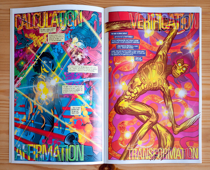
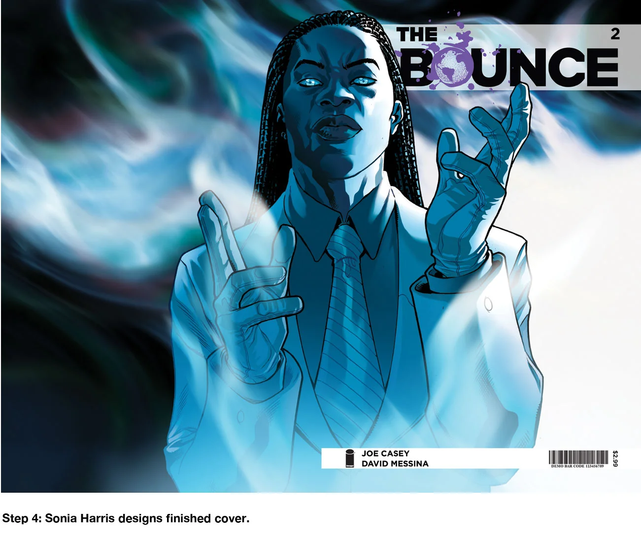
​If I only ever designed one kind of thing, whether it was books, posters, banner ads, websites, mobile sites, comic books, CDs, or splash pages, I think I would get stale. Luckily I work with all manner of clients on an ever-increasing range of design work and each time I learn something new about myself.