
Logo: Tisena
2026
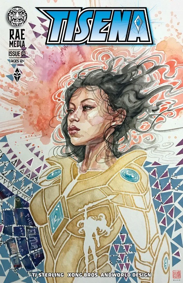
An elegantly punchy logo design for “Tisena”, written by TJ Sterling with art and colors by the Xong brothers, covers from Maika Sozo Nikolas Draper-Ivey Alitha E. Martinez and David Mack, published by Rae Comics.
2025
A Netflix romance game, with a logo to convey the precarious choice between commitment and excitement. Designed using a combination of a serif and handwritten fonts to evoke signatures on legal documents for a romance game. The word "love" in script gave the logo for each country a completely unique, expansive feel.
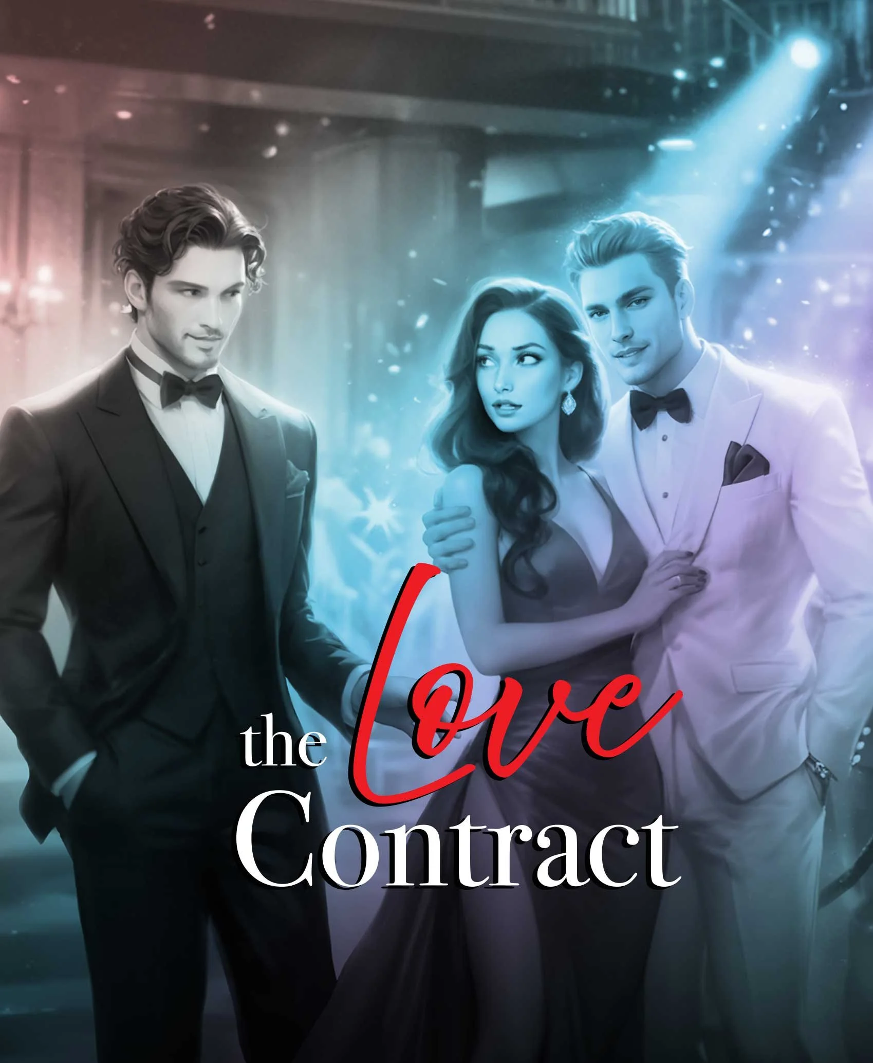
2025
The logo for a new Netflix romance game; "Tempted". Like the protagonists of the game, the logo is inconsistently transparent, catching the light with glints and glimmers. In every language I insured that two letters would gently rest together, giving a hint of the intimate plot of the game.
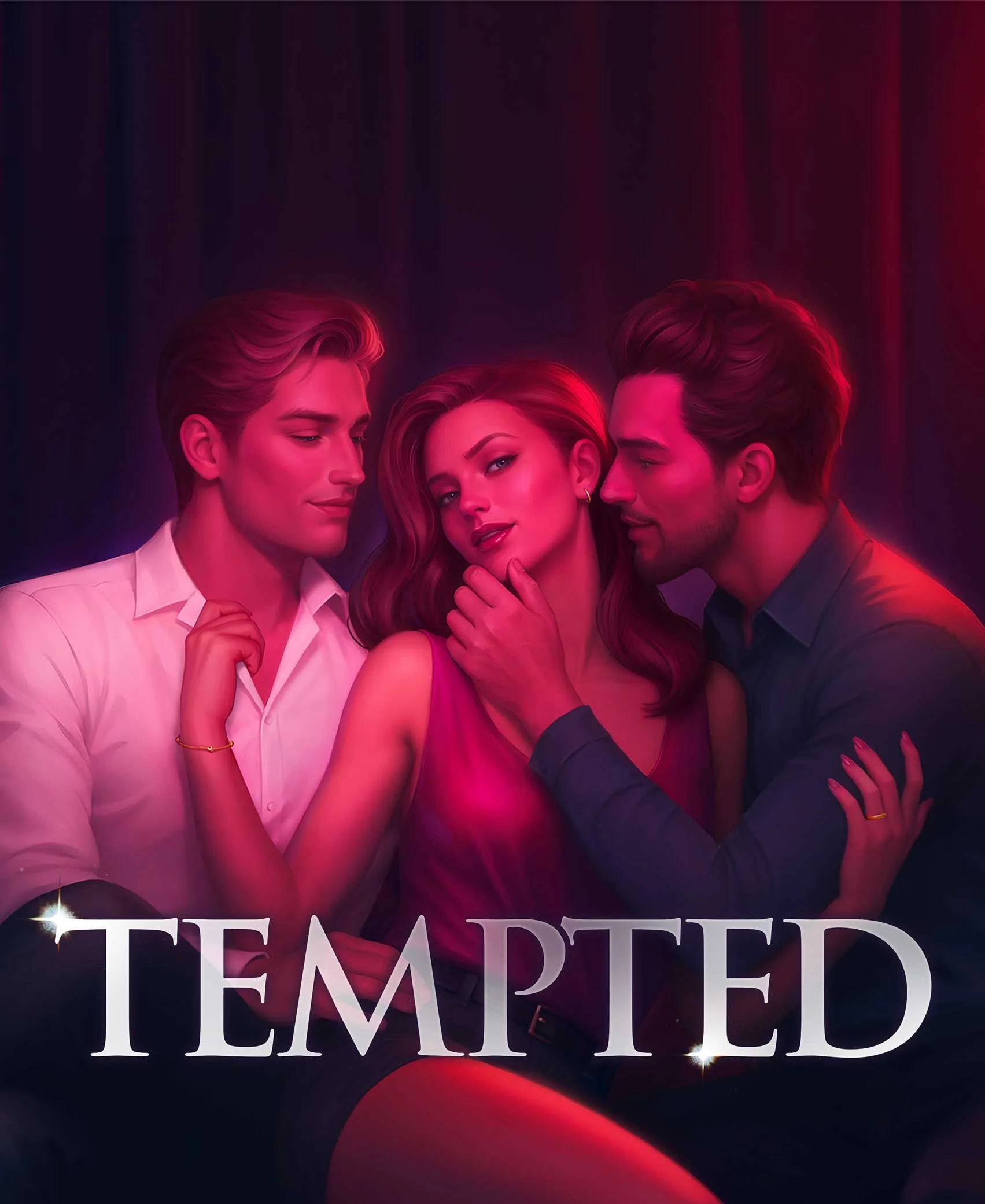
54m
2025
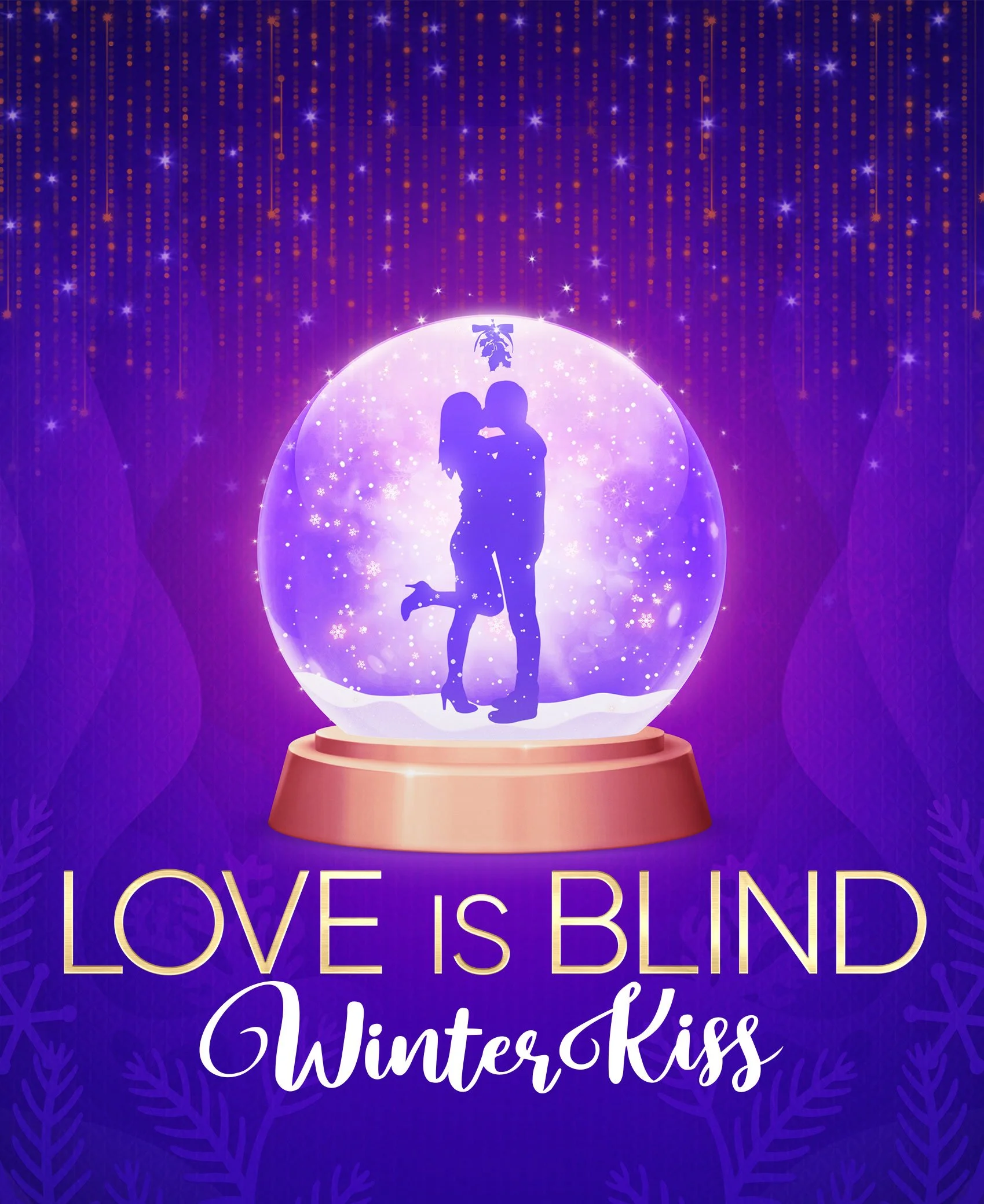
A simple logo for a potential "Love is Blind: Winter Kiss" game logo for Netflix. Designed for the romance genre, and to fit with the existing IP, it is organic but still legible in multiple languages and spaces.
2022
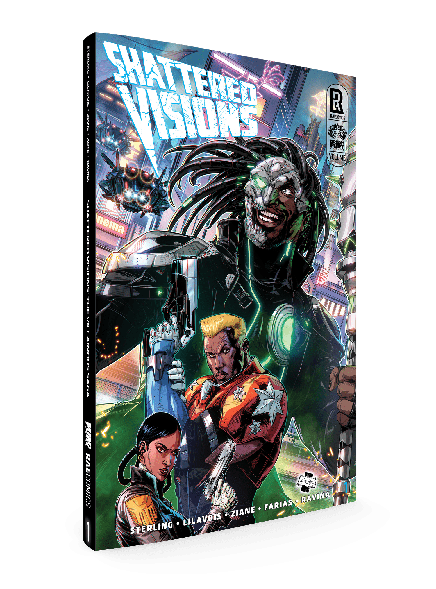
An overawed, distressed, futuristic logo design for this futuristic comic book set in 2189, “Shattered Visions” of a cyborg society at odds with itself. By TJ Sterling, Newton Lilavois, Edgy Ziane, Saloman Farias, and Loris Ravina. Published by Rae Comics.
2019
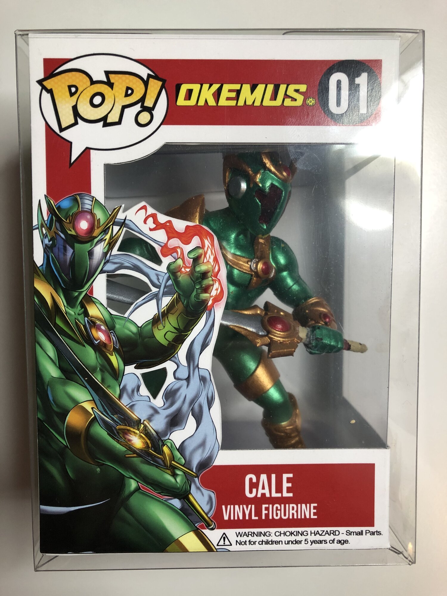
TJ Sterling’s tent pole character needed a bold, stylish, legible new logo. A year spent on revising and honing this deceptively simple logo gave the character exactly what was needed. Seen here on Pop figure from Rae Comics.
2019
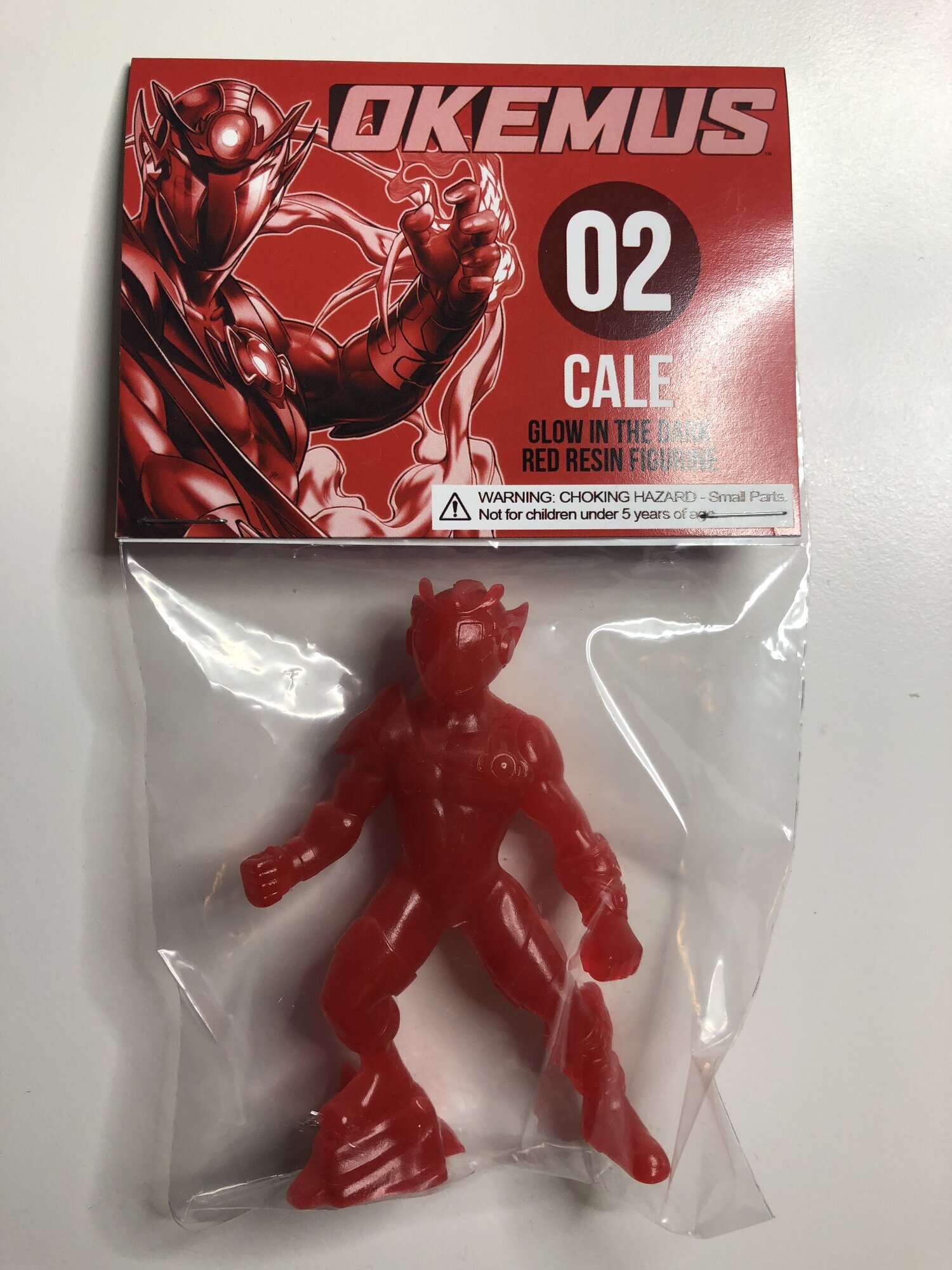
TJ Sterling’s tent pole character needed a bold, stylish, legible new logo. A year spent on revising and honing this deceptively simple logo gave the character exactly what was needed. Seen here on action figure from Rae Comics.

2019
TJ Sterling’s tent pole character needed a bold, stylish, legible new logo. A year spent on revising and honing this deceptively simple logo gave the character exactly what was needed. Seen here on a black and white variant issue of the comic book from Rae Comics.
2018
A fun, clean, modern logo design for this playful, mischievous, futuristic satire by Andrew Maxwell, Goran Gligović, Adam Pruett, Bernado Brice and Sonia Harris.

2015
A visually strong logo, designed to be easy to read and quick to recognize. The simple iconographic elements hint at the kind of equation depicted in the story and the tight layout conveys a dense, packed quality, echoing the intensity of the connections portrayed.
2014
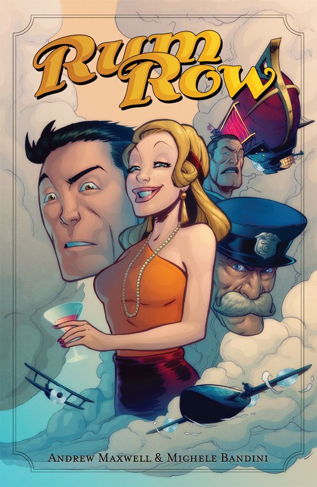
For this period comic book (by Andrew Maxwell & Michele Bandini) set in the late 1920's - early 1930's a logo was required that would evoke the spirit of classic adventure tales of the era. From the initial broad variety of designs, the client chose this sweet and zaftig design to accompany the cover art and it was finished off with a simple decorative frame layout.
2016
A stylish logo for a comic book written in the style of 1930’s American pulp fiction. Made by Joe Casey, Luke Parker, Brad Simpson and Sonia Harris. Originally published on the Stela app, then reprinted in the compilation Image Comics book; “Annual”.
2013
Logos for a comic book series in which the logo echoes the story development by growing to obscure the cover. The animation above charts the phases of 11 issues of the logo expansion.
(The comic is available from comic book stores or online in a digital format.)

2017
Logo design for the cover for “Aldous Spark” by Andrew Maxwell, Peter Miriani, and Mauricio Alvarez.
2010
Strong "stamp" style brand for this innovative technology manufacturing company.
2010
Unique logo design using a custom typography, with a matching streamlined site and collateral. Material is simply and cleanly branded, while the style guide maintains the brand across platforms.
2010
Unique logo design using a custom typography, with a matching streamlined site and collateral. Material is simply and cleanly branded, while the style guide maintains the brand across platforms.
2010
Unique logo design using a custom typography, with a matching streamlined site and collateral. Material is simply and cleanly branded, while the style guide maintains the brand across platforms.
2010
Unique logo design using a custom typography, with a matching streamlined site and collateral. Material is simply and cleanly branded, while the style guide maintains the brand across platforms.
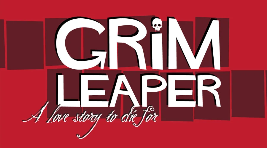
2012
Logo for a new comic book from Image / Shadowline Publishing. Created to evoke the madcap adventures of cinema in the late 1950’s, this logo design and tagline completes the look over cover art by Aluisio Santos. Kurtis Wiebe’s story of a man and woman leaping from dying body to dying body, meeting over and over again in each life, is a romantic yet macabre adventure that I felt evoked movies like “Vertigo” and “Seconds”, so I sought out a contemporary take on a Saul Bass-inspired design. More about the process is written here.
2010
Strong "stamp" style brand for this innovative technology manufacturing company.
2011
Logos, cover design, and interstitial pages for this Image Publishing comic book, by Joe Casey and Mike Huddleston. Designed to evoke classic action-hero comic books.
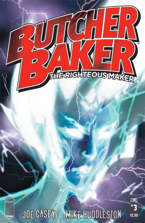
2011
Logos, cover design, and interstitial pages for this Image Publishing comic book, by Joe Casey and Mike Huddleston. Designed to evoke classic action-hero comic books.
2011
Basic logo to raise the profile of this solar panel manufacturer. Designed to highlight the dual message of clean, nature-friendly energy and an ecologically superior production process.
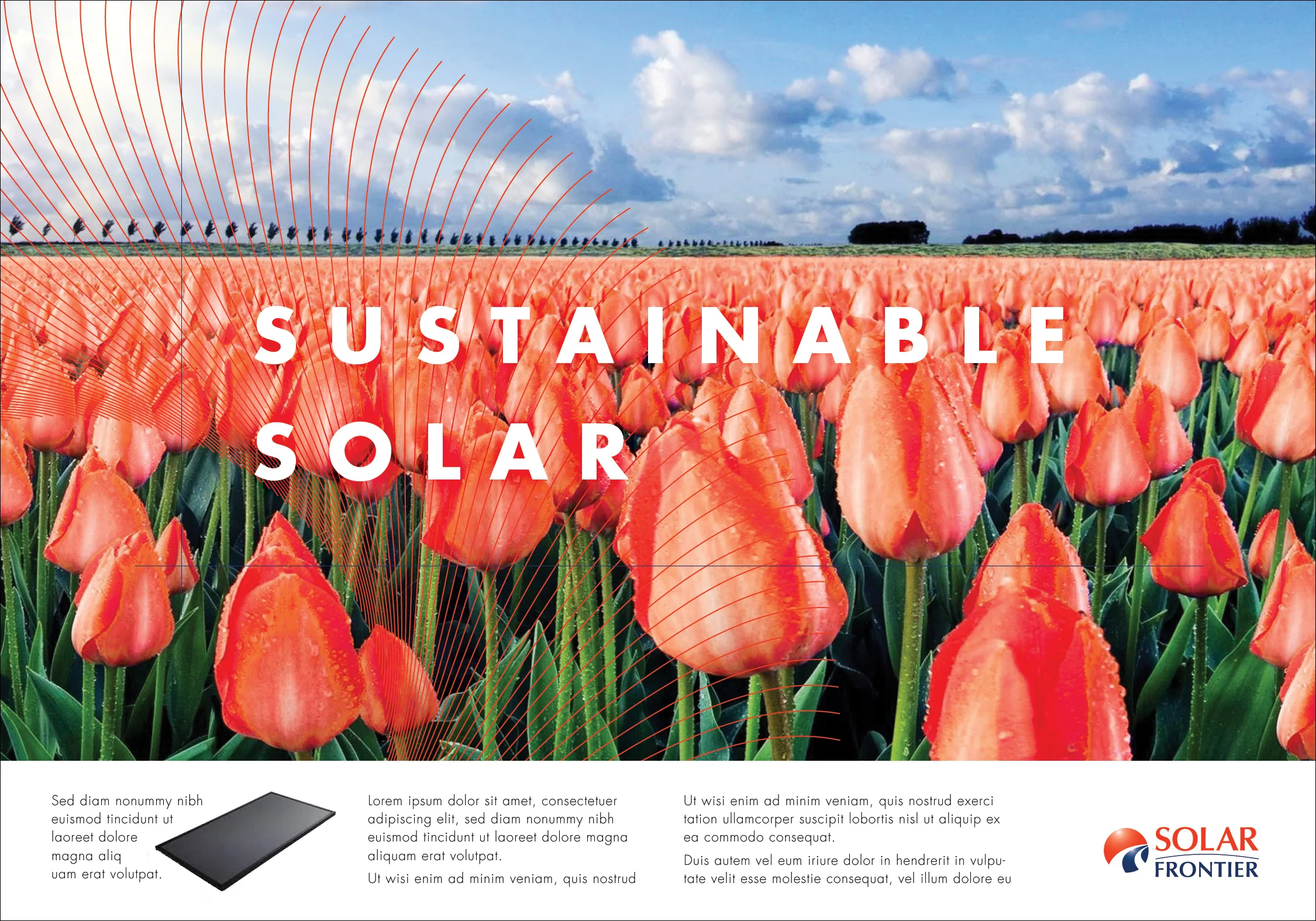
2011
Basic logo to raise the profile of this solar panel manufacturer. Designed to highlight the dual message of clean, nature-friendly energy and an ecologically superior production process.
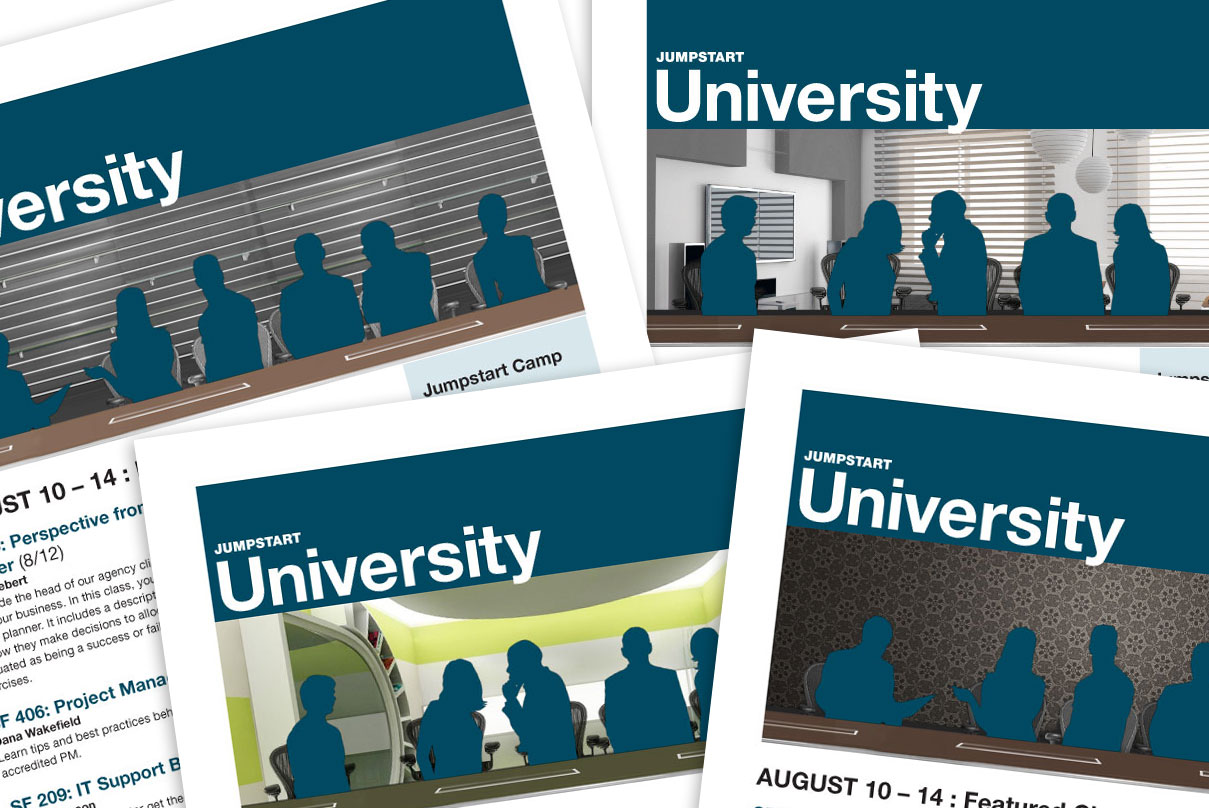
2010
For internal communiques and training programs these modular, user-friendly designs for internal posters and emails can be populated with any content and still maintain a visible brand.
2009
Designed to embody the concept of efficiency within sustainable automotive technology, this logo mark is created from a cyclical, expanding pattern of wheel nuts.
2009
Designed to embody the concept of efficiency within sustainable automotive technology, this logo mark is created from a cyclical, expanding pattern of wheel nuts.
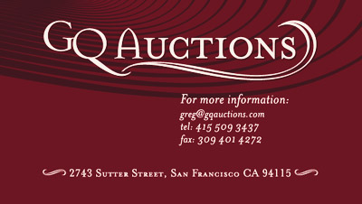
2006
Logo, identity, and business cards designed for Greg Quiroga, professional auctioneer.
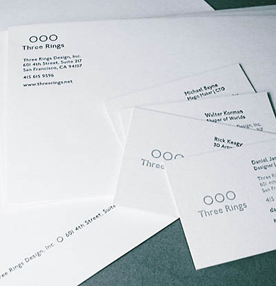
2006
Clean, simple logo design for this game design company. Using letterpress printing on heavyweight card stock and irregular sized cards create a memorable impression.
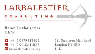
2005
Mark and lettering to convey the ancient meaning of the name "Larbalestier", with a classic, deep red used with a light silver printing for the brand mark.
2016
Taking a lead from the client's concept and working closely together, this logo combines symbols which speak to the activity and philosophy of this business. Sticking to a sparse, clean style, the various elements intertwine and compliment each other.
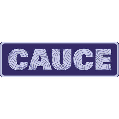
2005
A logo for the oalition Against Unsolicited Commercial Email, designed to convey the complexity of the repetitive email practices which CAUCE seeks to combat.
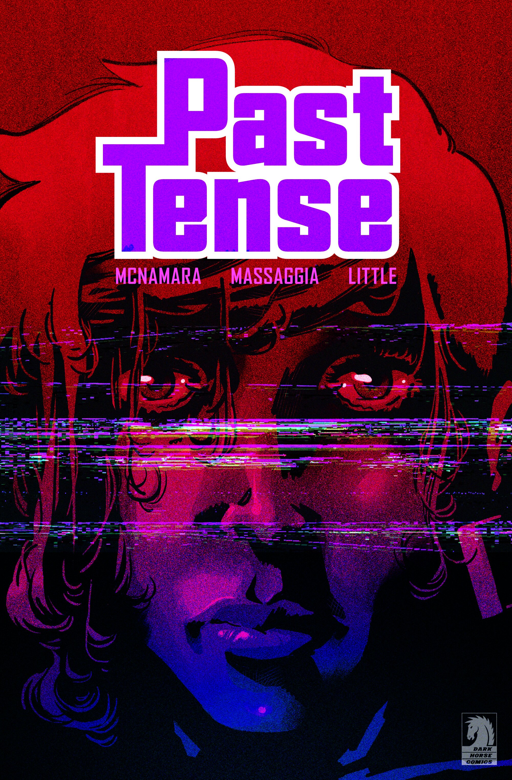
2022
A comic book cover treatment to create a more technologically ominous imagery with an iconic logo design to work as both title and corporate story device.
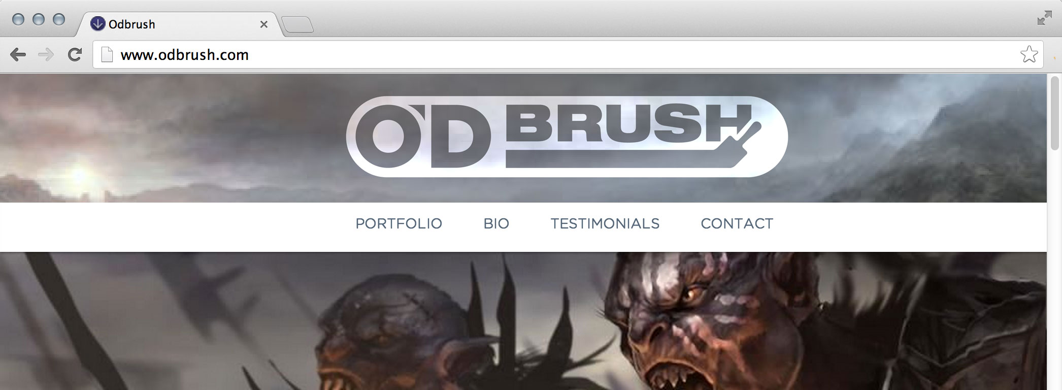
2013
A logo for artist Sean O'Daniels, designed to evoke his role as a painter, in the format of a clean, bold, stamp which could work to brand any materials (shown here as the header of the artist's website, overlaying examples of his work).
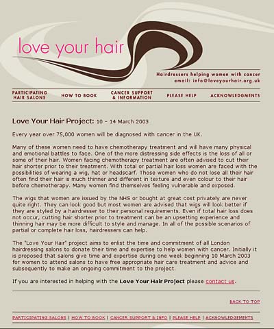
2004
Instantly recognizable logo and branding for this charity to provide free haircuts for cancer patients.
2006
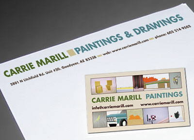
Business cards and letterhead designed to compliment the website and reinforce the artist’s presence.
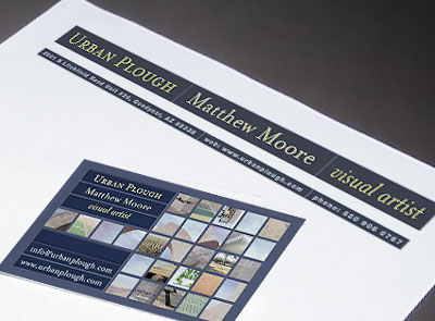
2006
Business cards and letterhead designed to compliment the website and reinforce the artist’s presence.

2005
Illustrative representation of user-interface expert Kuniavsky's url "Orange Cone" is the dominant visual aspect of the cards.
2004
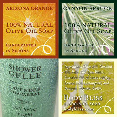
Labeling and photography for this Sedona-based line of natural body products.

2002
Labeling and photography for this Sedona-based line of natural body products.